Communication Technology 1005: Visual Composition
Outcomes: (as per the Alberta curriculum)
1. identify and discuss the elements and principles of design
1.1 define the elements of design
1.2 identify the elements of design using examples
1.3 describe the impact of each element on the visual message;
1.4 define the principles of design
1.5 identify the principles of design using examples
1.6 describe the impact of each principle on the visual message; e.g., balance, emphasis, proportion (scale), repetition (rhythm/pattern), unity, contrast, harmony, proximity, variety
2. discuss typography as it relates to the use of text in visual messages
2.1 explore the meanings of common terms used in typography; e.g., capline, topline, midline, baseline, beardline, serif, san serif, ascender, descender, bowl, counter
2.2 discuss the use of the elements and principles of design in purposeful text creation; e.g., attention-getting text versus readable text
2.3 discuss the role of whitespace in the use of text
3. produce visual compositions using a variety of media, e.g., print, photography, video, animation, where a number of elements and principles of design are used and have an identifiable impact on the intent of the message
4. identify copyright restrictions and permissions and put them into practice
5. present a selection of work completed in this course to an audience
5.1 discuss work regarding:
5.1.1 how the elements and principles of design help facilitate good composition in his or her work
5.1.2 the technical and creative aspects of the work; e.g., quality, uniqueness
5.1.3 areas of concern/difficulty (if applicable) 5.1.4 meeting school and community standards; e.g., appropriate language
5.2 add the selected work to a portfolio
6. participate in a critique or an assessment of compositions created by others; e.g., classmates, professionals
6.1 identify elements and principles used in the images
6.2 comment on the impact of the elements and principles in the construction of the message
High School Assessment Rubric:
Assignment 1: PowerPoint Presentation - Elements and Principles of Design, Typography, Copyright
Instructions: Create a Powerpoint/Google Slides Presentation with 5 different Topics:
List of required slides:
1. An about you slide: This slide should be about something that interests you and you can use for visual examples throughout the rest of the website. (Do not use personal information). Examples: anime, superheroes, cars, fashion, sports, artwork, video games. When choosing the theme please remember you will need to depict the subject visually.
2. Elements of Art Slides: These slides will define and graphically demonstrate the Elements of Art
3. Principles of Design Slides: These slides will define and graphically demonstrate the Principles of Design
4. Typography Slides: These slides will define and graphically demonstrate Typography.
5. A Copyright Page: These slides will illustrate your knowledge of Copyright restrictions and Permissions
Here are the concepts you will need to define and illustrate:
Please use this format to title your slides: Elements of Art: Line
|
Elements of Art:
Line Shape Colour Texture Value Form Space |
Principles of Design:
Rhythm Repetition Proportion Unity Variety Movement Balance Harmony Contrast Emphasis |
Copyright:
What is the copyright law in Canada? What is fair use? |
Readers, check out: https://en.wikipedia.org/wiki/Composition_(visual_arts)
Watchers check out: https://www.youtube.com/watch?v=YqQx75OPRa0
Typography: https://www.canva.com/learn/typography-terms/
Copyright: www.ic.gc.ca/eic/site/cipointernet-internetopic.nsf/eng/h_wr02281.html#understandingCopyrightwww.ic.gc.ca/eic/site/cipointernet-internetopic.nsf/eng/h_wr02281.html#understandingCopyright
Easy to understand U.S Copyright:
https://www.copyright.gov/help/faq/faq-protect.html#:~:text=Copyright%20does%20not%20protect%20ideas,your%20written%20or%20artistic%20work.
Here is an example of what I should be seeing on your Powerpoint/Google Slideshow/website starter:
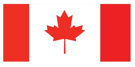
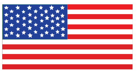
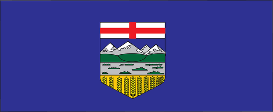
Assignment 2: Adobe Illustrator - Flags: Shape Tool, Layers and Fill
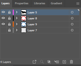
As you saw, vector graphics are great for creating images that can be shrunk and enlarged because they use mathematical formulas to create images. The mathematical relationships therefore stay the same. This means that vector images make great logo's, flags, etc.
Your task is to create 5 flags in Adobe Illustrator. The flags must be replicated as closely to the original as possible. You may not copy and paste the flag. You may not take any images off the internet to help. You must draw it using only the tools found in illustrator. For example the line tool, the shape tool etc. You will be asked to label and print your flag on 8x11 paper, with a text caption of the county, You will be assessed on the final printed copy of your favorite flag, not the image files.
Here is a good site to browse flags.
flagpedia.net/index
Here is a youtube crash course tutorial that goes through all the basic functions of illustrator in 5 minutes.
https://www.youtube.com/watch?v=3GzumUieDPY
Instructions and Tips:
|
1. The Hud: You will find that the hud in illustrator is fully customizable. You will need to mess around and find ways to put all of your tools where you want them. The first thing I would do is click up in the top right hand corner and choose "Essentials Classic". This will give you a wide variety of tools that are normally hidden in properties up to the top of you hud
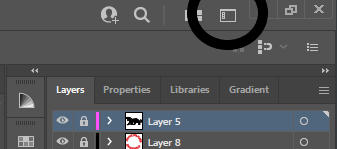
2. Find your layers panel. This is the most important part of any Adobe product. Leaning to use layers is an essential skill to be able to create things in photoshop, animate or illustrator. They all work almost essentially the same way in all three programs. In fact in almost all Adobe programs. I would drag my layers out to my right side so that I can see them all the time.
3. The Layers Panel: Here you will see a + box, a garbage can, an eyeball and a lock. The plus sign, adds a layer, the garbage can deletes selected layers. The eyeball hides or reveals the layer, so you can work above it or below it and the lock sign makes it so the layer is un-editable which is handy when you don't want to select objects on different layers. 4. Shape Tool and Fill and Stroke. On the left you will find a shape tool. Right click on it to make all sorts of shapes. If you double click on the shape itself you can modify it. I.e. you can make a triangle by modifying the polygon tool to only have 3 points. Lastly the two boxes at the bottom, determine your fill colour and your stroke colour. My fill is set to red, and my stroke is set to black. Setting them to a red strike through will make them invisible. This should be all you need to make the flags. If you are looking to make further detailed flags, lets take a look at the next tutorial as well. |


|
|
|
Assignment 3: Adobe Illustrator - Vectorize a Logo: Pen Tool, Curvature Tool and Join Command
|
Assignment 3: Find and trace a simple logo on Adobe Illustrator (Vector Graphics)At this point you should be starting to feel more confident with the way your layers and tools work in illustrator. In this assignment I want you to trace a simple image.
Steps: 1. Find a simple logo you would like to trace. Example logos are to the side 2. Open a document in Illustrator and drag your file to the bottom layer. |
|
|
3. Select your bottom graphic and reduce the opacity to 33%, then lock it. (The menu is at the top if you are using illustrator essentials classic)
4. Insert a new layer on top of your graphic. |

|
|
5. Begin using the drawing tools on the left. Experiment with the pen tool and the curvature tool to begin outlining your image. The way these tools work, is that they create "anchors" at every place you click and join the anchors with lines. We will begin to manipulate these anchors in later credits, but it is important to start working with them now.
Note: Adobe Illustrator only fills what it believes to be enclosed paths. If you want the fill tool to work correctly you need to close all of your paths with the "Join" command: ctrl+J. ctrl+J will connect two anchors together in what it believes is the best way. 6. Selection Tools
There are two selection tools in Adobe Illustrator. One is a regular selection too that manipulates the full vector and the other direct selection tool manipulates the anchors and handles within the vector. Learn how both tools work as anchors are the second most important tool within Illustrator after layers. |


|
|

Unfortunately Weebly does not support svg files, so you will need to download and look at both of these. The svg opens in a web browser (which weebly is displayed on :/ and the illustrator file gives you a bit of undertanding of what I am looking for with layers and paths. Both are important for this assignment. You will notice that the raster on the left is fuzzy compared to the images below. Vector images should be clean and almost perfect.
Credit: Alex Fischer
| ||||
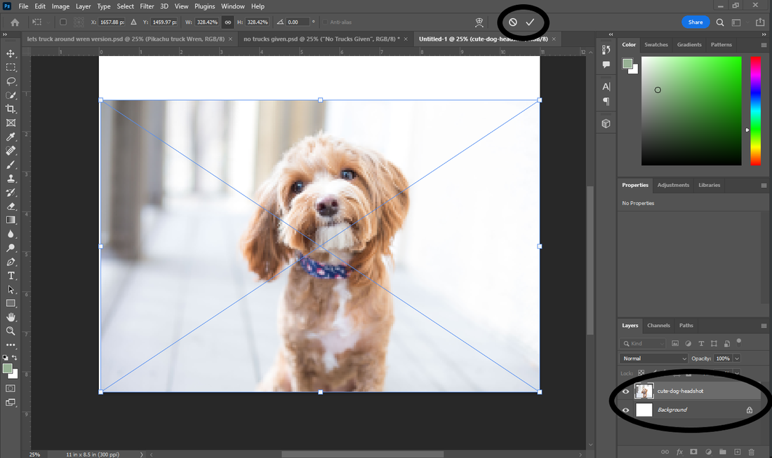
Assignment - 4 Adobe Photoshop - Change a Background in Photoshop - Layers, Selection Tools, CTRL - C, CTRL - V, ALT - T
This assignment is a way to get you familiar with photoshop's layering and selection process.
Assignment: Change the background in a photo.
Assignment: Change the background in a photo.
|
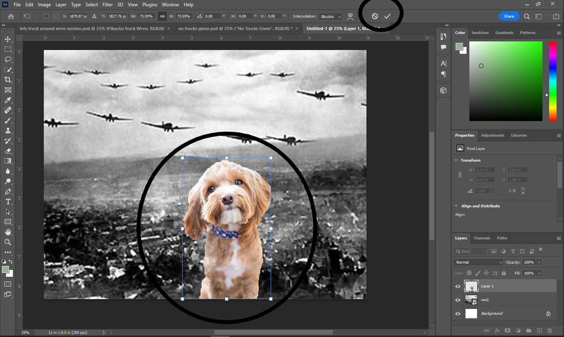
1. Find a photo that would be suitable to change the background (I am not assigning this because it's more hilarious when students choose something that inspires them. Click save as and save it on your desktop.
2. Drag the png/jpg into the background artboard of photoshop. Once you do that you will have this... one of the most frustrating parts of photoshop is that you need to confirm where you want it with the checkbox before you can start working with it. Move it where you need it and click the checkmark that is circled.
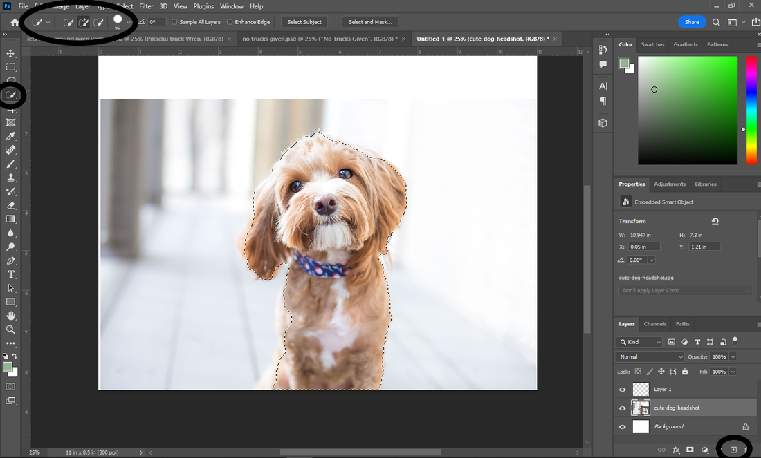
3. Create a new layer (its the same as Adobe Illustrator, although the layers are visible in the bottom right corner).
4. Select the foreground of your image using the magic select tool or the lasso tool, or any selection tool you wish. The magic selection tool behaves a lot like the paintbrush tool. Pro tip is the ] and [ keys make your brush larger and smaller. There is both a plus and minus tool shown beside. If you select more than you want switch to the - tool and take the selection away. Once you are done selecting everything you want... 5. Copy your selection to the new layer. Use the command CTRL+C, switch to the new layer and use CTRL+V. You now have your new dog on a new layer. The dog is in the exact spot as the original dog and the layers are transparent, so it wont appear as if you have done anything. Until you delete you first layer with the dog and background. Look on the layers to the right.
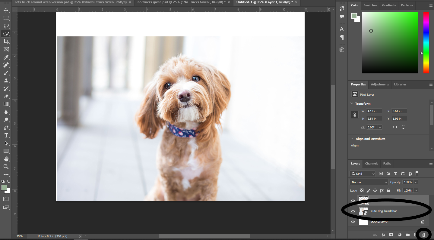
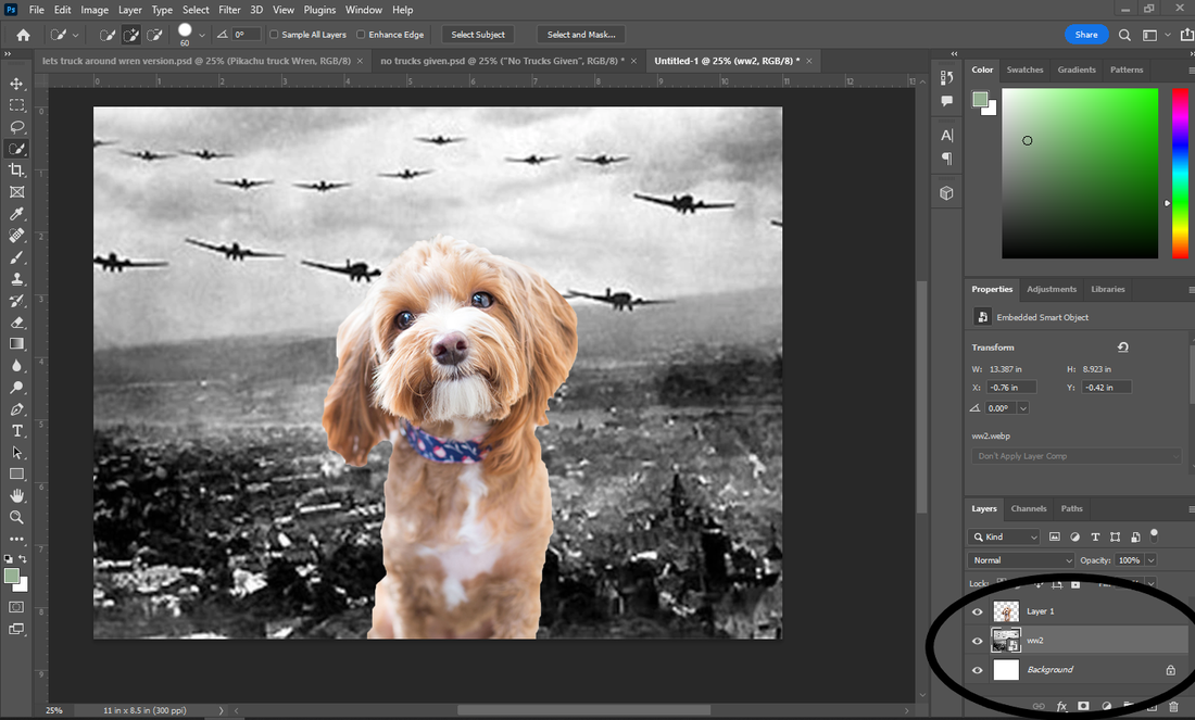
6. Delete the original layer that your dog is on. 7. You should now have a dog with a blank background waiting for a new background. Find a new background, add a new layer under the dog layer and drag the background to that layer.
8. At this point I'm kinda digging it. But it might be best to use our transform tool to mess around with the proportions of the dog and background. CTRL+T can be pressed with the correct layer chosen, to have a free transform box come up. Now I can make my dog as big or as small as I want. When I am done modifying the size, I need to commit my changes again with the checkmark at the top.
9. Lastly I want to export my image as a png (portable network graphic) to be able to be posted anywhere.
To do this I simply go to export under the file menu and choose quick export as png. It will ask you where to save it and name your file. Boom. Submit both your last .psd file and your ping to you folder to be graded. |


| ||
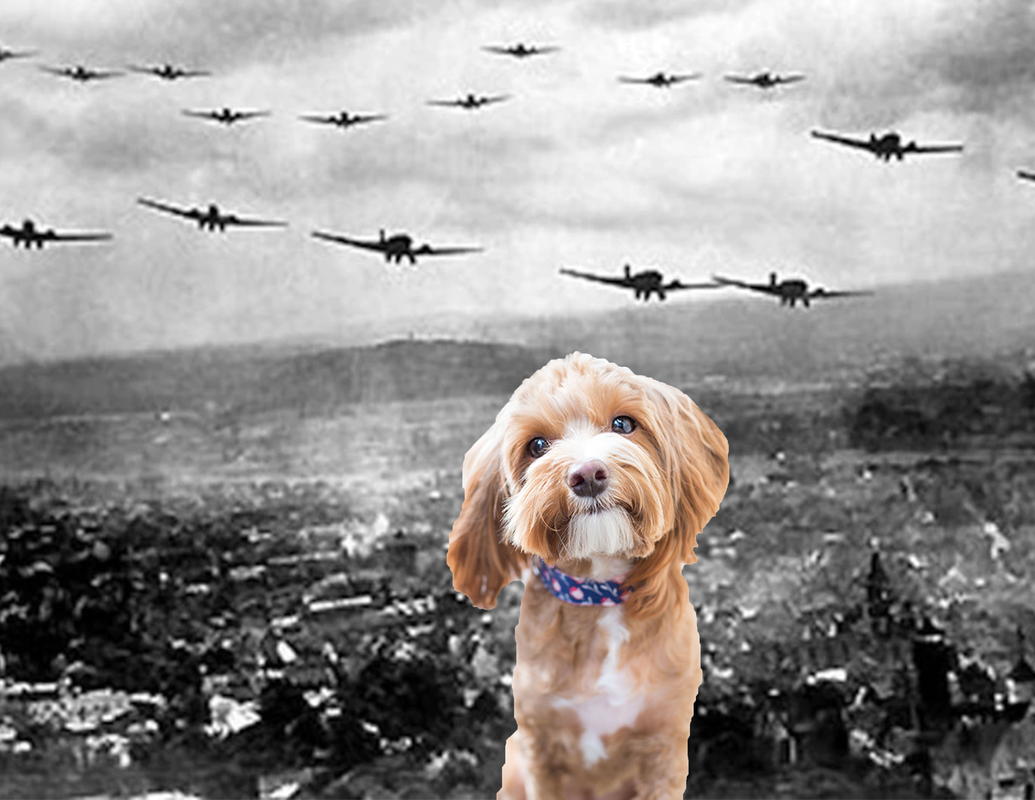
Behold the FOG OF WAR!
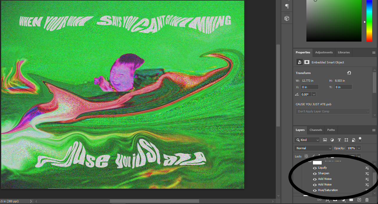
Assignment 5: Adobe Photoshop - Create/Deepfry a Meme - Text Tool, Adjustments, Saturation, Brightness, Liquefy.
|
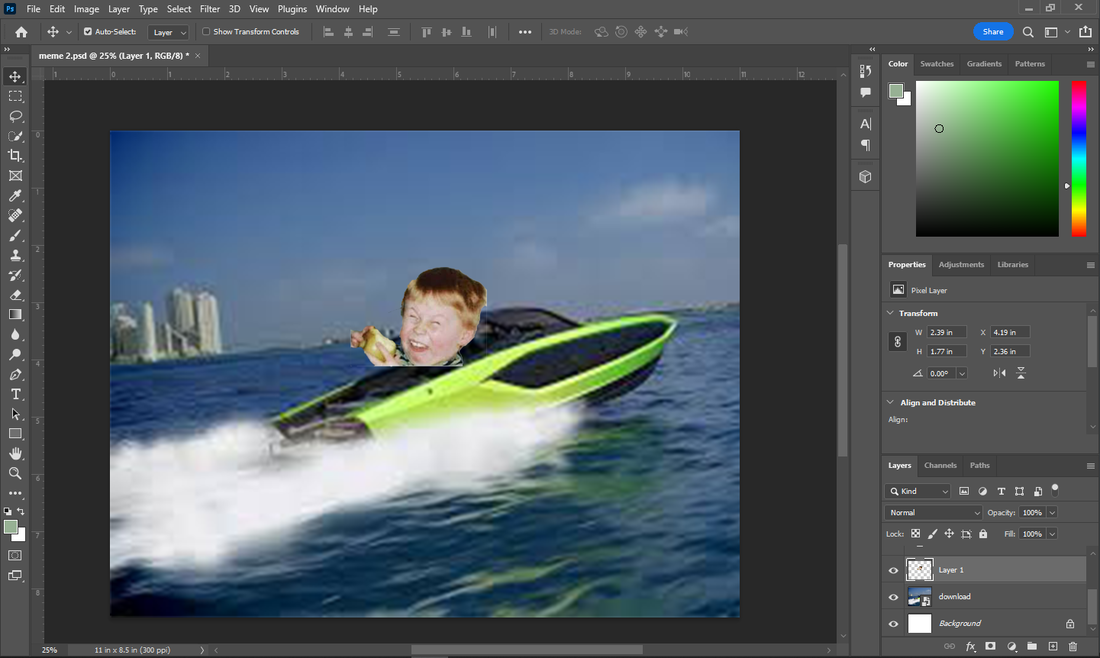
Not much more to say. Grab an image, throw on some text. Clean it up and make it look good.
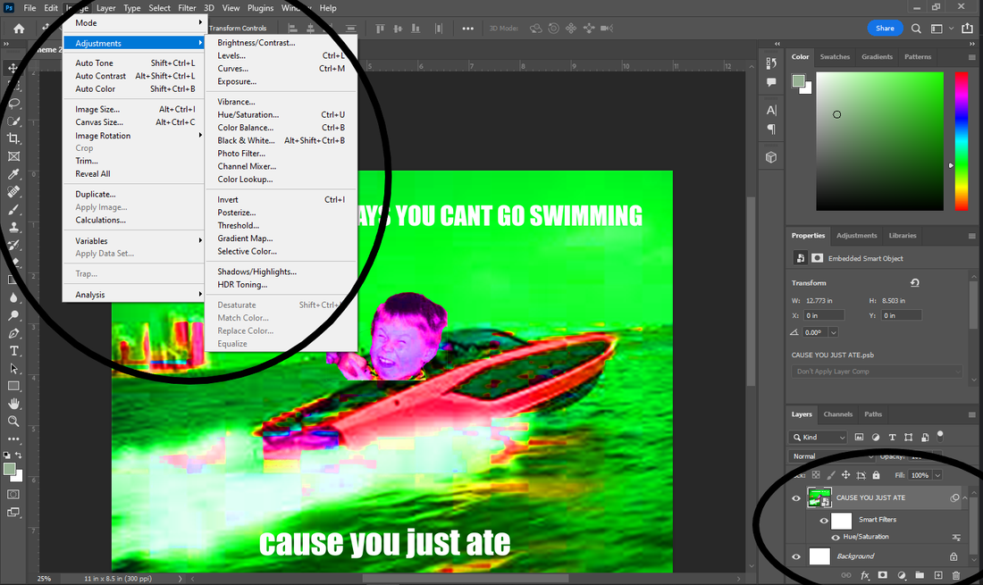
Steps for create a meme: 1. Find an image that would make a good meme (or a pre existing meme image).. Import it into Photoshop. Do not use a meme generator for text. Here is a database of memes: https://knowyourmeme.com/memes/popular 2. Add, change the background. Finish the image 3. Add text. Memes generally have a top line of text and a bottom line. Make sure the text is readable and uses meme format. The text in photoshop that makes memes is "Ipact".
Couple things about text. Each text box will create a new layer for you to manipulate. There are multiple ways to manipulate the text. From the properties bar on the right part of the hud and on the top. The font and the size can be changed and if youre looking to get real fancy you can start to move into the the "type" dropdown menu at the top of the hud. You can mess with many different effects. Save this file as your first meme and submit it. Now Deepfry the same meme: 1. Re open the psd file. 2. Select all your layers at the bottom right (hold shift while you select) and then right click and "convert to smart object". This will allow you to work with them all at once. Now your ready to deepfry. 2. Under the Image -> adjustments menu, go to hue saturation and turn the saturation way up. 2a. Play with any setting here to see what colours you like. Brightness, hue, saturation 3. Under the Filter tab, sharpen as many times as you see fit, maybe add some noise. Then when its all good. Liquify it. You can change your brush size with liquifying by using the [ and ] keys. 4. The point of this assignment is to create something as absolutely messed up as possible while still making it readable. I will be looking at your layers, to see what adjustments you applied and what you experimented with. 5. Save as JPEG 6. Post for Profit. Tutorial here: https://www.youtube.com/watch?v=E-za-RQBpVA |

Credit: Veronica Martinez
|
Examples:
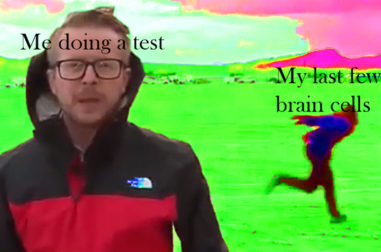
Credit: James Pho
|
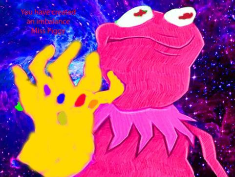
Credit: Xander Panelli
|
